Design
Solution Overview
myPATHH

Boulder Crest has developed a responsive web application called myPATHH during the 18-month aftercare portion of their Warrior PATHH program. Students use the web app to complete assignments, set goals, and watch videos on topics like fitness and meditation to help them integrate the lessons of Warrior PATHH into their daily lives.

Our team identified a number of opportunities to redesign sections of myPATHH and implement our design principles while addressing user needs uncovered in our research.
Dashboard
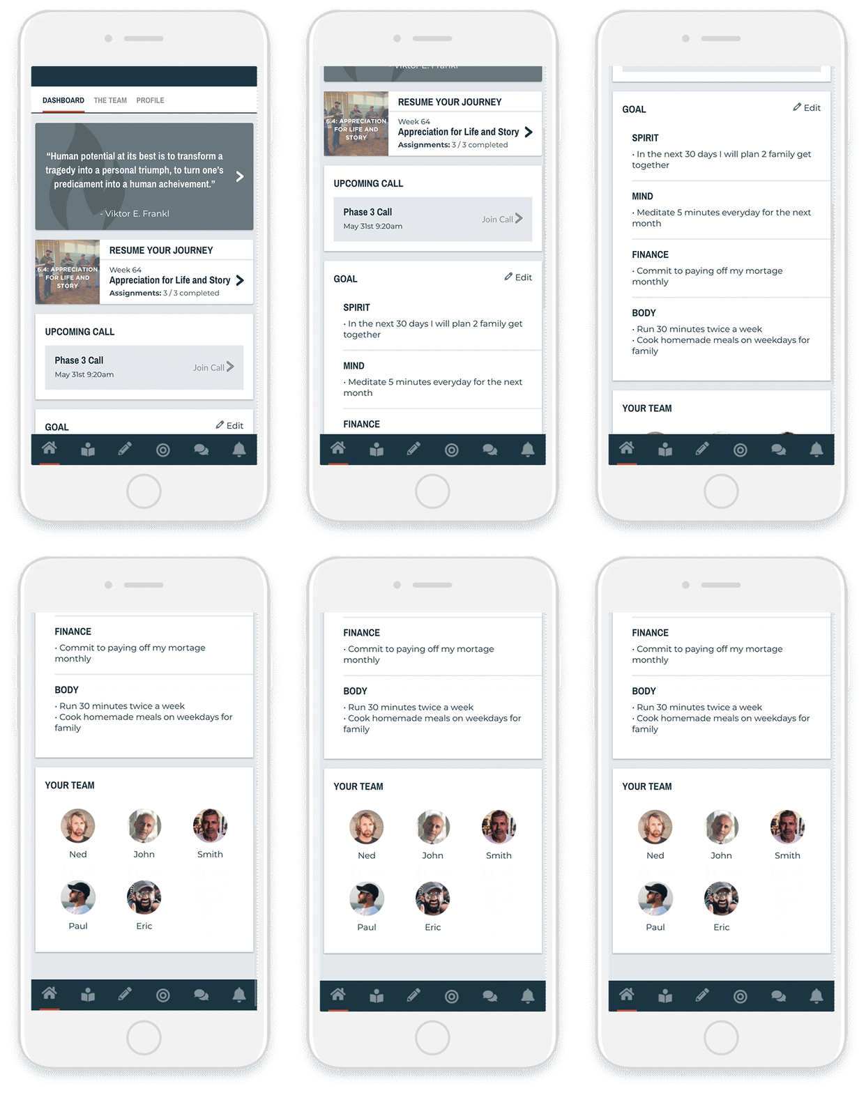
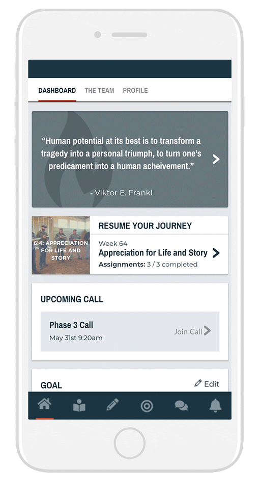
The Dashboard is the first page that Warrior PATHH students see in myPATHH. As a result, the experience with this page sets the tone for the rest of their session on the app. We decided with our client that this should be the first portion of myPATHH to work on.
Read More
Assignment
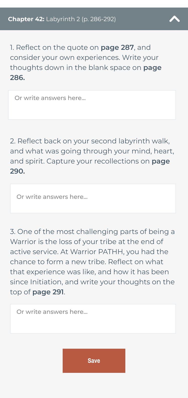
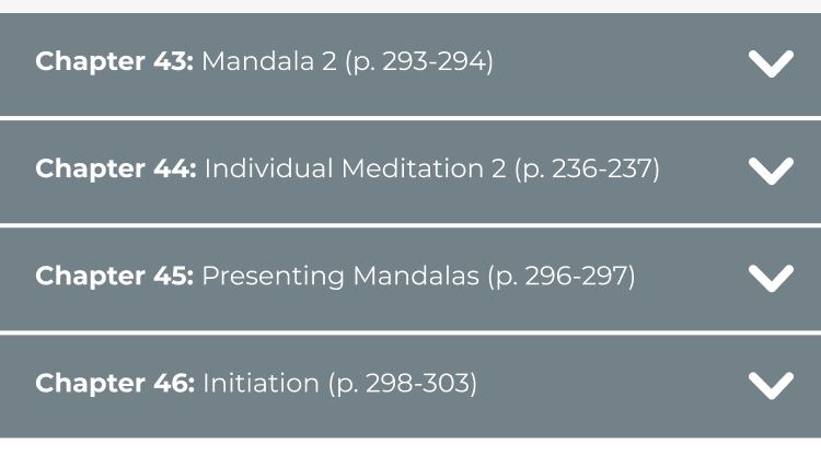
The myPATHH assignments section is an integral part of myPATHH where students complete reading, writing, and video activities. These activities teach students how to integrate Warrior PATHH lessons into their daily lives. We decided with our client that redesigning this portion of myPATHH would be valuable to the overall Warrior PATHH experience.
Read More
Roadmap
The Warrior PATHH experience is about so much more than technology. Beyond the myPATHH redesign, we created a set of service design recommendations. Boulder Crest students and staff showed us the value of connection across the larger Warrior PATH program. To honor the journey of Boulder Crest and its students, we decided to integrate the concept of journey into our final student-defined deliverable by creating a roadmap of additional recommendations for myPATHH redesigns and organizational service design changes.
Read More
Design Principles
We developed a set of design principles after our initial myPATHH dashboard co-design session—which we will dive deeper into below— that would guide us from that point forward, from creating the final prototypes of the myPATHH dashboard and assignments section to developing the larger Warrior PATHH roadmap.
Consider People’s Mindsets

Choose features that cater to when students are struggling or doing okay.

Warrior PATHH students experience ups and downs as they navigate the 18-month program. They could be stressed, happy, frustrated, or any other mix of emotions. We need to design experiences that meet people where they are at. Furthermore, we need to design experiences that do not exacerbate negative emotions but instead equip them with lessons that they need in order to navigate emotions and situations.
Phase 1
myPATHH Redesign
Accenture UI Kit → S2S kickoff
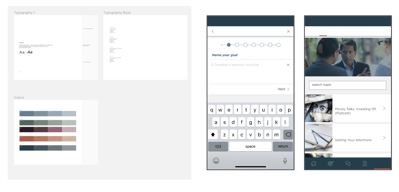
myPATHH was not our idea. The first version was born out of wireframes and design specs created by Accenture for Boulder Crest and developed by a software engineering team called Shoulder 2 Shoulder. When we kickstarted the myPATHH redesigns, our first step was to retrieve these design specs from Shoulder 2 Shoulder so that we could establish a design system of fonts and colors to work with. These standards would ensure a smoother transition when we ultimately handed our work over to Shoulder 2 Shoulder to develop.
Co-design

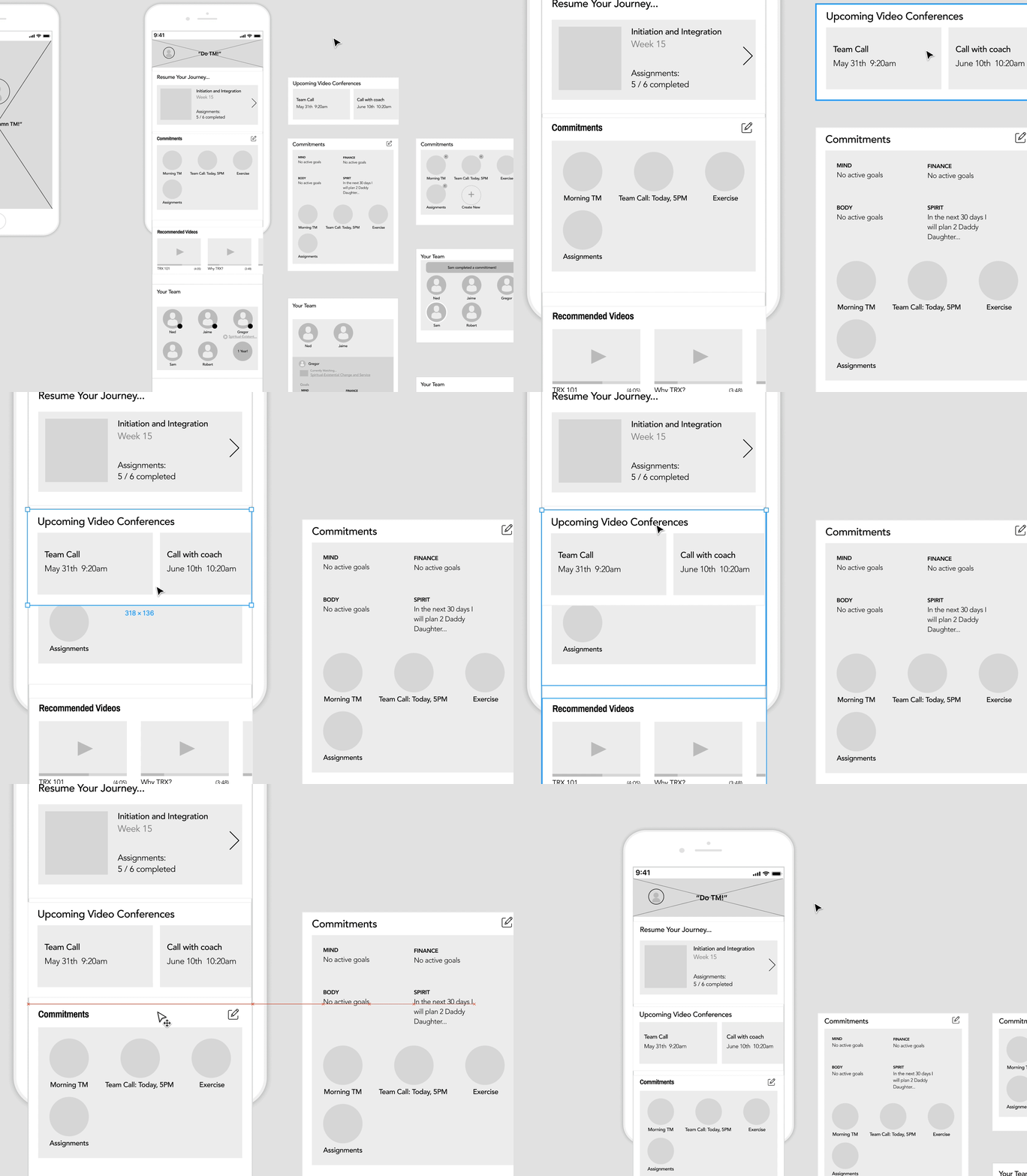
Instead of starting out by developing a low-fidelity prototype of a new version of the dashboard, we decided to involve Boulder Crest students in the design process.

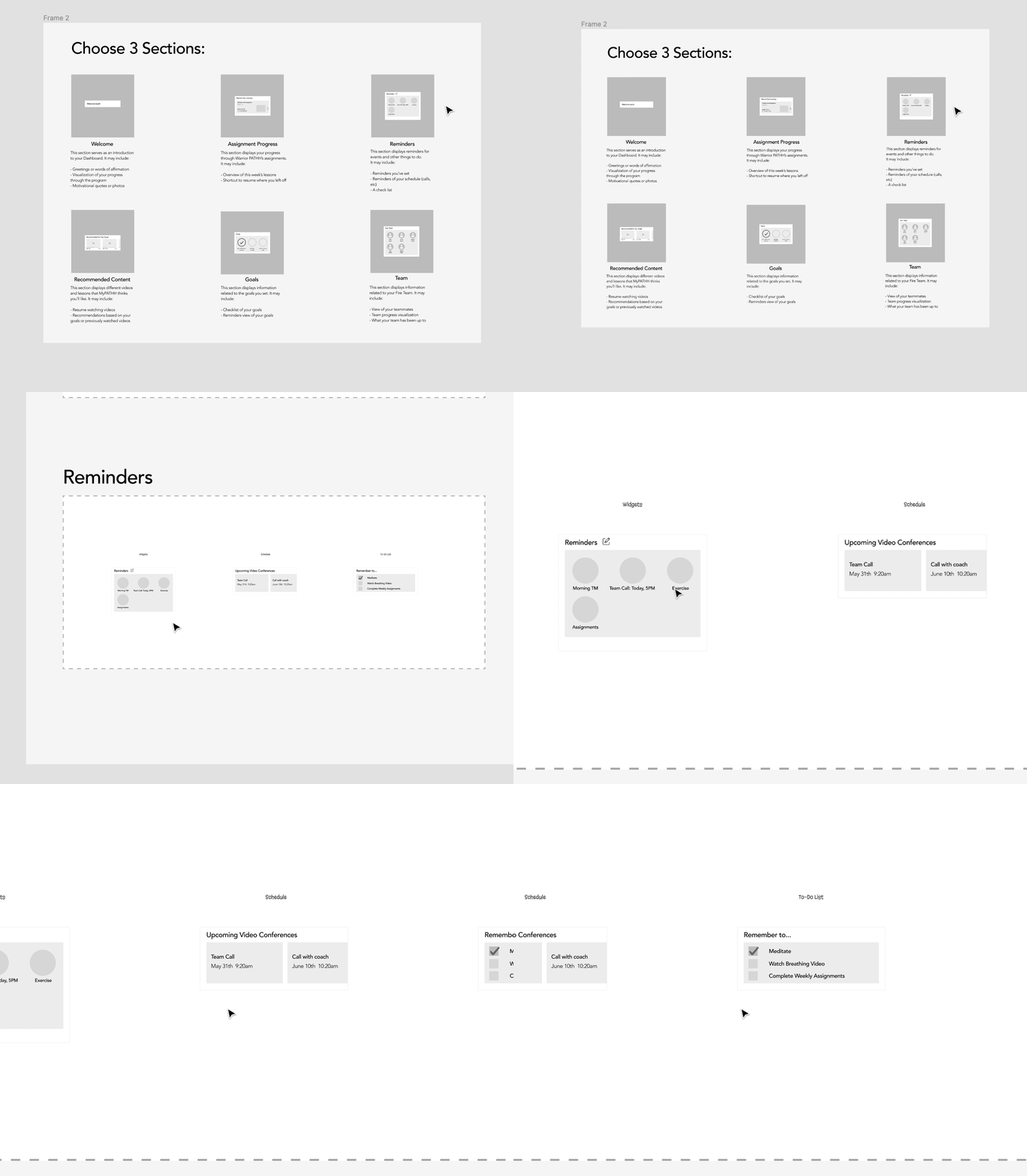
After recruiting three Warrior PATHH alumni for 30-minute research sessions, we walked each participant through an artboard that we had set up in Figma containing various high-level feature categories for the myPATHH dashboard: Welcome, Team, Assignment Progress, Goals, Reminders, and Recommended Content.

During the interview, we asked our participants to construct their ideal Dashboard using various modules within each category.

While it was helpful to understand which ones were useful or not, it was ultimately valuable for us to understand the “why” — the reasoning behind their selections. These insights directly established our Design Principles.

Current myPATHH–Dashboard

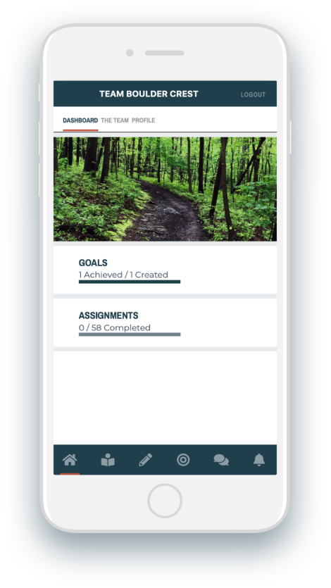
The original version of the dashboard displays two things: how many goals a student has accomplished out of the number of goals they had set, and the number of assignments they had completed out of the 58 assignments throughout the duration of the 18-month program. We saw an opportunity for the dashboard to better assist students in staying connected to their teams and lessons throughout Warrior PATHH.
Final Design
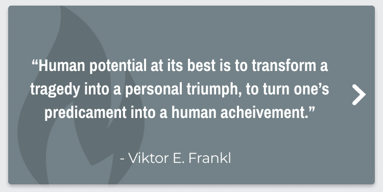
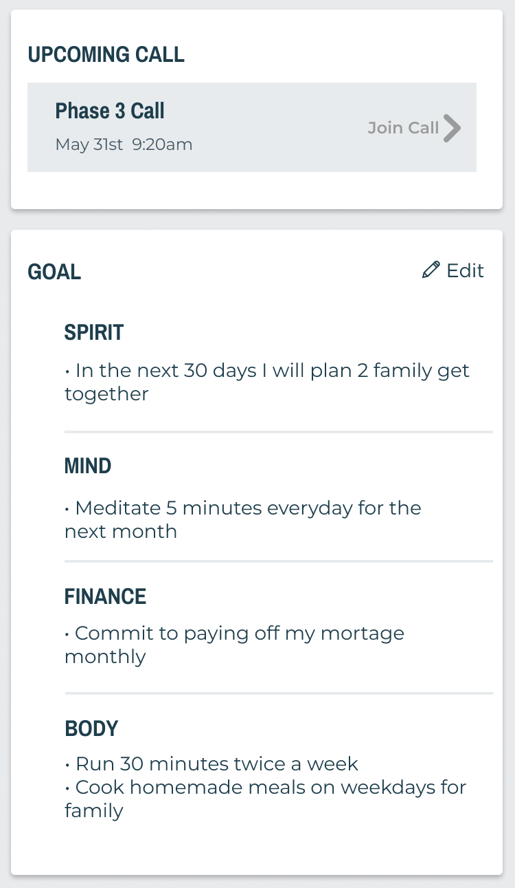
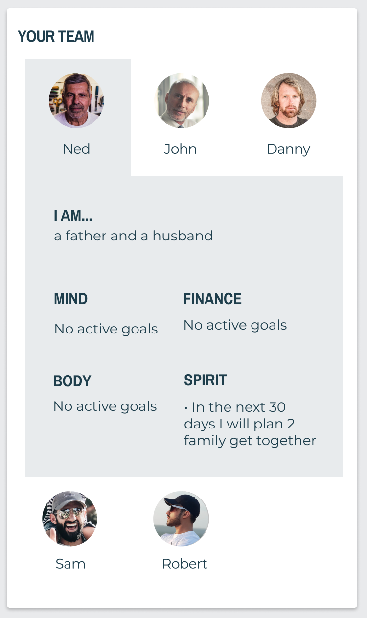
Our final designs for the dashboard incorporate many of our design principles. We created shortcuts to critical components of the aftercare program such as students’ current assignments and links to their Fire Team’s video call. We also wanted students to feel supported on their journey from the moment they opened the application. Daily quotes and visual reminders of their Fire Team accomplish this.
Go to The Prototype
Hover over the icons to read details.
1
2
3
4
Consider People’s Mindsets
Daily quote
Encourage and support journey
Promote Behavior Change
Shortcut to current assignment
Promote Behavior Change
Soft reminders
Inspire Team Support
Team
Current myPATHH–Assignment

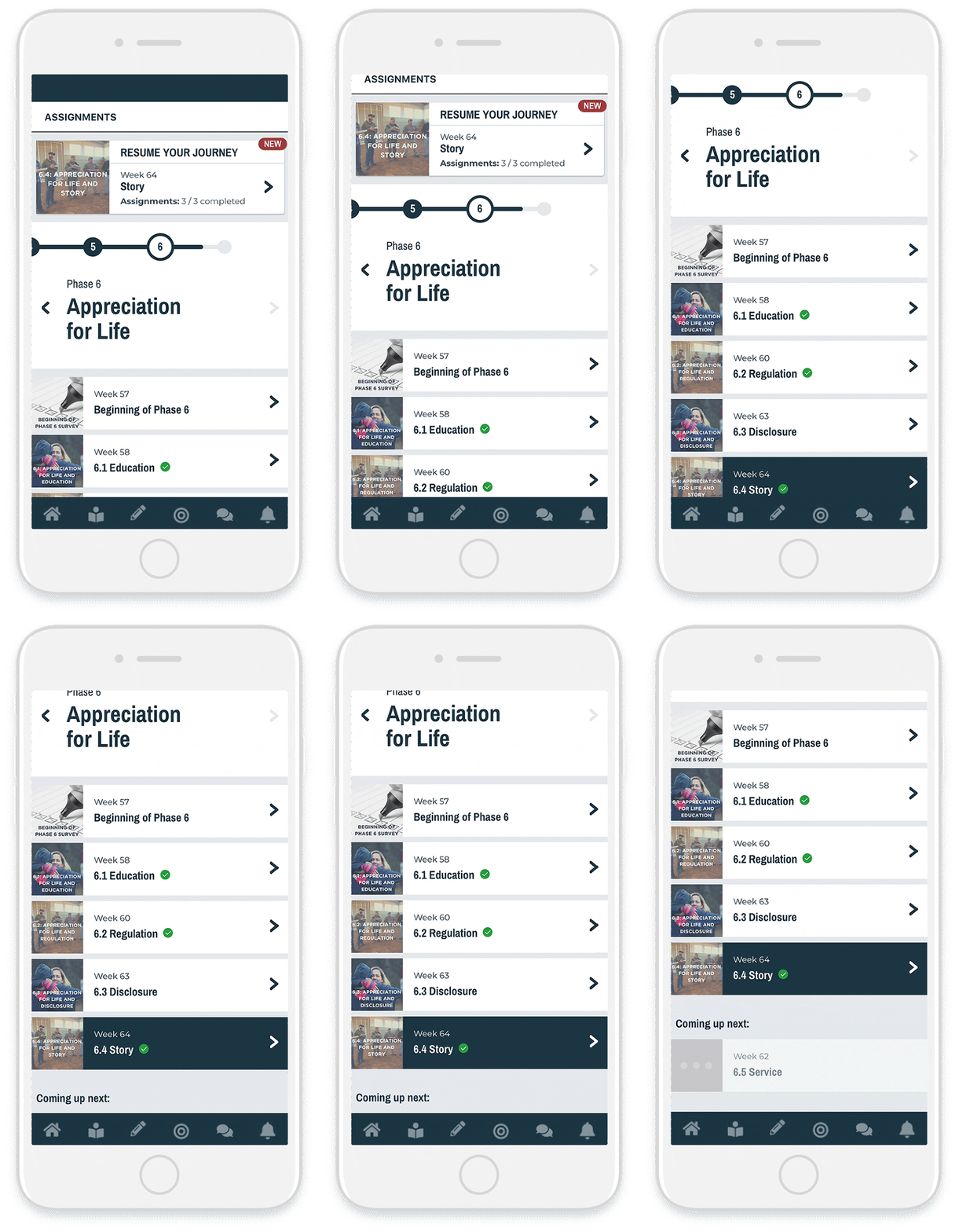
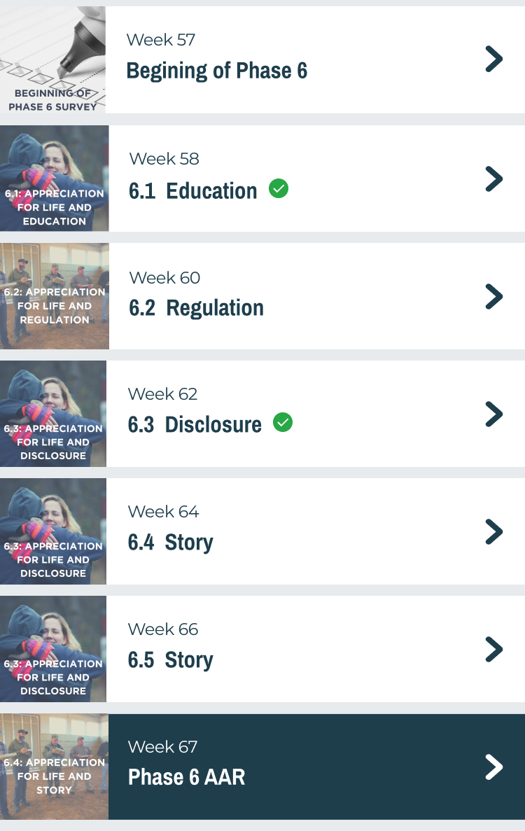
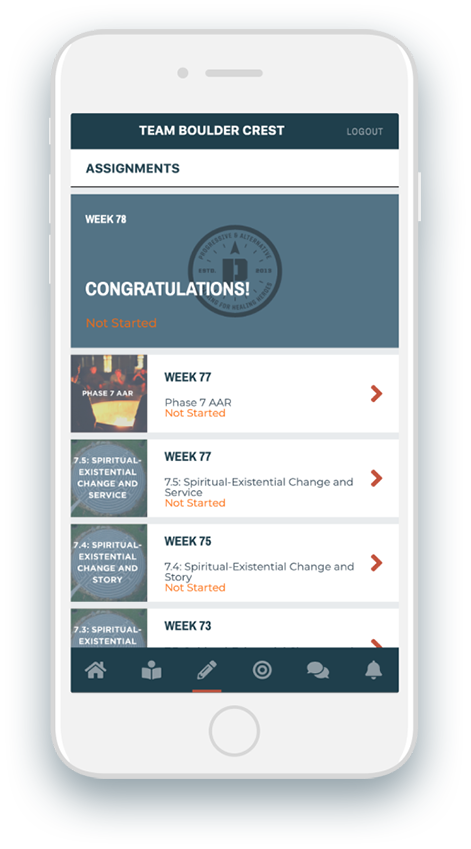
The original version of the assignments section displays a view of all assignments released in correspondence with which phase they are at but does not provide a clear indication of where students are at in their overall journey with Warrior PATHH. Students also are not able to save assignments to return back to them.

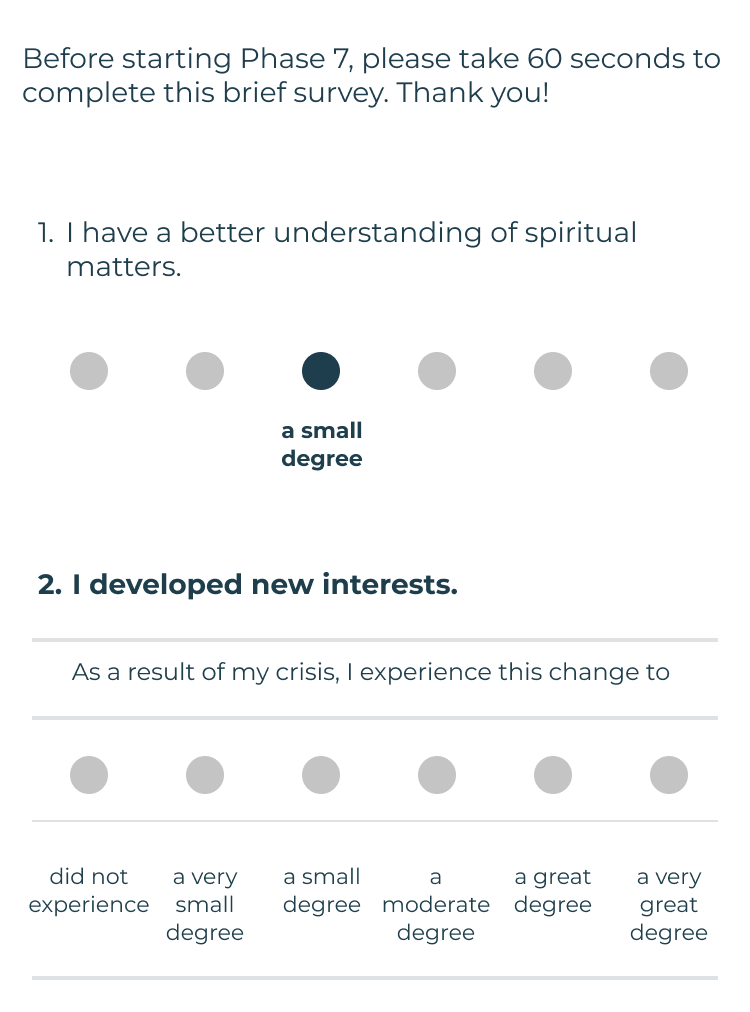
At the end of each phase, students also receive within the assignments section an After Action Review, which is a survey to help Boulder Crest understand how helpful each phase’s content has been and its impact on the student’s progress.
Final Design
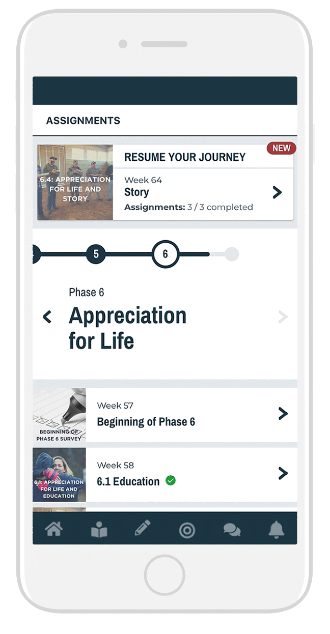
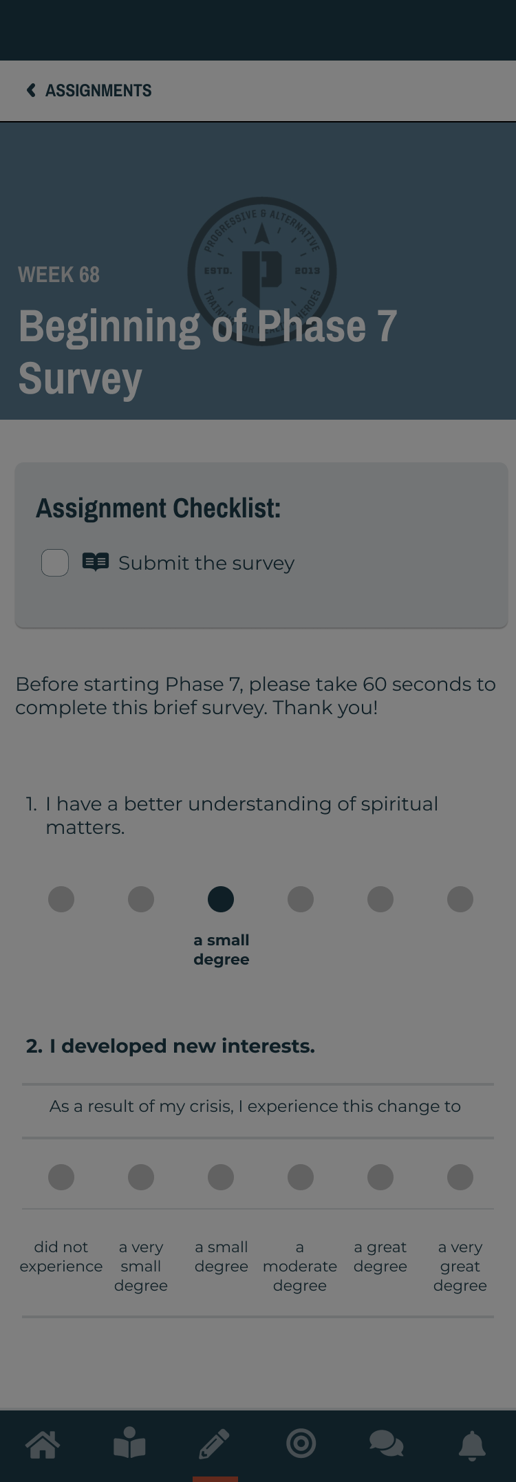
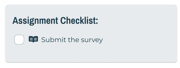
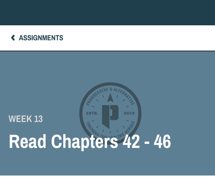
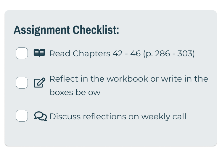
Our final designs for the assignments section focused on visualizing information. Large modules and a prominent timeline allow for easy navigation without losing track of students’ current position. Furthermore, we reformatted assignment pages to encourage readability. A checklist at the top of each assignment page punctuates our redesign by concisely stating what students need to accomplish.
Go to The Prototype
Hover over the icons to read details.
Navigation
Weekly Assignment
Survey Assignment
1
2
3
4
5
Encourage and support journey
Promote Behavior Change
Shortcut to current assignment
Encourage and support journey
Prominent Progress Bar
Encourage and support journey
Celebration message
Encourage and support journey
Provide only required amount of information
Promote Behavior Change
Shaded “Next Module”
1
2
3
Encourage and support journey
Checklists
Encourage and support journey
Promote Behavior Change
Divided Items and Easy-to-Edit Assignments
Encourage and support journey
Collapsed Chapters
1
2
Encourage and support journey
Checklists
Encourage and support journey
Scroll Animation and Focusing Next Question
Testing
As part of our iterative design process, we conducted a series of eight evaluative interviews as various points of developing our final prototype. These represented a diverse set of perspectives, including men & women, students, coaches, and staff, and familiarity with the current version of myPATHH. Using screen share to connect with remote participants, we treated these primarily as think-alouds to understand how people reacted to our new design work. We addressed both usability (whether they understood the functionality) and desirability (whether it met their needs in satisfying ways), and allowed this feedback to influence our moving toward final designs.
Phase 2
Service Design

The Warrior PATHH experience is about so much more than technology. Beyond the myPATHH redesign, we additionally wanted to create service design recommendations because Boulder Crest students and staff showed us the value of connection across the larger Warrior PATH program. Throughout this project, our definition of engagement shifted beyond the screen to consider the value of engaging students with their teams and lessons and using myPATHH as a tool to facilitate those connections.

As a result of this reframe, we needed to find ways to support Boulder Crest students as they navigate the touchpoints of the Warrior PATHH program and integrate the lessons into their daily lives. Service design is a useful framework for helping Boulder Crest consider the touchpoints between students, staff, technology, and other channels to help students reach their goal of struggling well, especially as Boulder Crest plans to scale Warrior PATHH. Based on our research, we saw opportunities to improve these touchpoints through service design.
Speed Dating
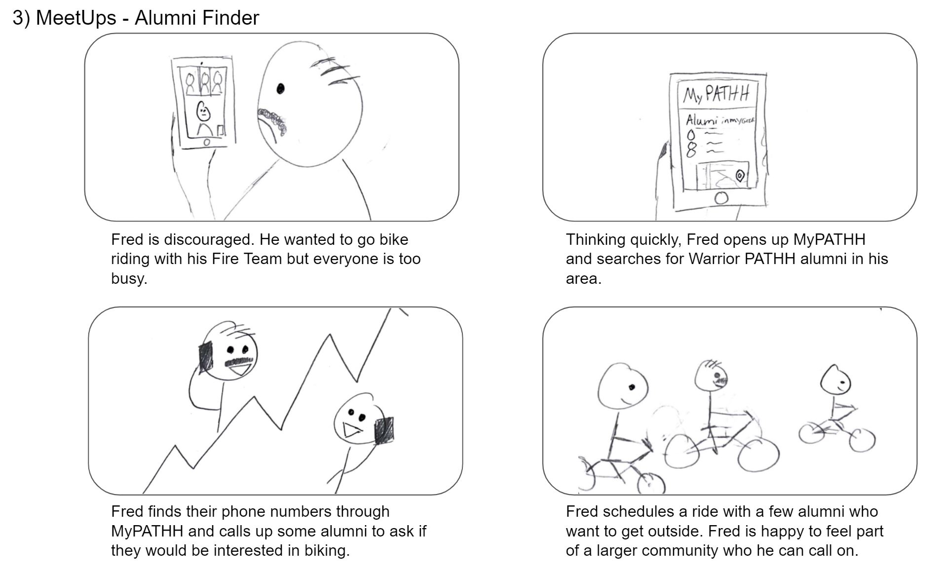
To test the feasibility and overall reactions to our ideas, we conducted a series of speed-dating interviews. Simple storyboards depicting scenarios for additions or changes to Boulder Crest’s service offerings were shown to both students and staff. Several variations on each theme were shown in sequence, varying in the style and intensity of the potential solutions. Some storyboards were intentionally either close to the current state, unrealistic to implement, or provocative - the goal was to understand the underlying needs and values, as well as any constraints or limitations on what people are comfortable with. The general areas we explored were: In-person community organization Sharing Boulder Crest experiences with family (students only) Sharing personal stories with a wider Warrior PATHH community (students only) Incorporating the VA Logistics of scaling (staff only)
Arizona Trip

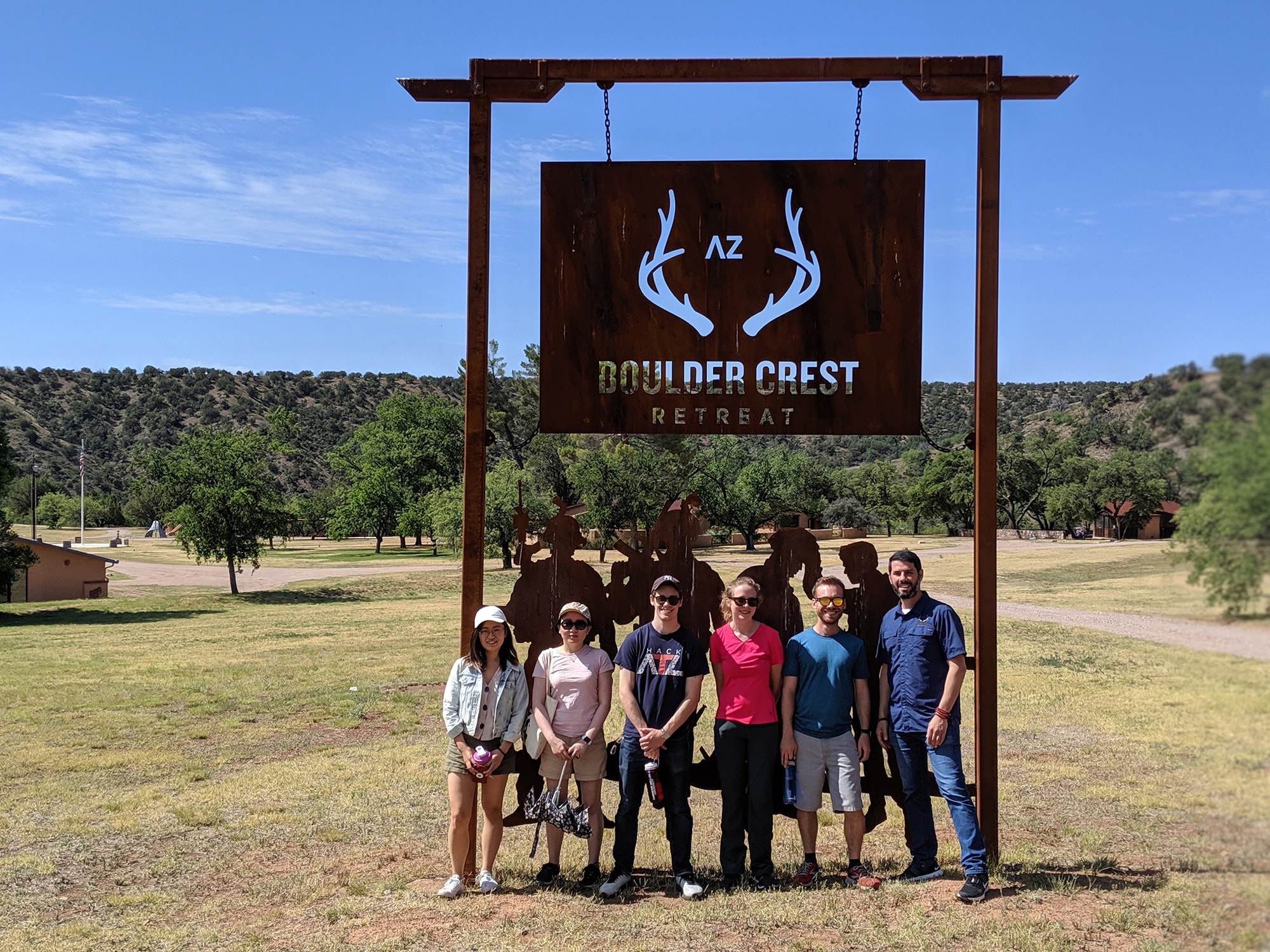
The highlight of our summer and service design process was a trip to Boulder Crest’s Arizona location. Since Boulder Crest plans to expand Warrior PATHH to eight new partner locations within the coming years, considering this process of scaling is essential to an understanding of how Boulder Crest will operate as an organization. Since Boulder Crest Arizona represents the first example of Warrior PATHH’s implementation at a second location, learning from their staff was uniquely valuable for our process.

We were lucky enough to spend two full days at the massive ranch in the Coronado National Forest in southern Arizona. After touring the gorgeous facility, we had the opportunity to conduct interviews with everyone on the staff. We heard the stories and unique perspectives of the team, and also went through our storyboards to get in-person feedback on our service design ideas.

Roadmap
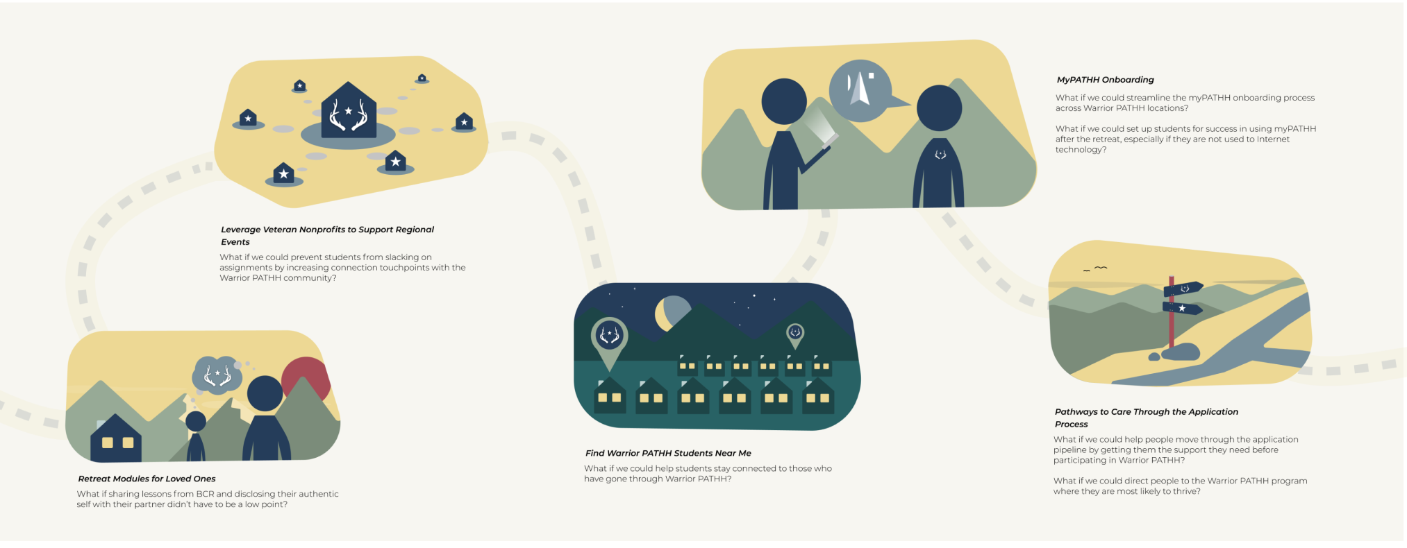
The culmination of our service design exploration is the roadmap of future projects, shown to the right, all of which we believe have the potential to enhance the student experience. Although we have chosen to depict these recommendations as steps along a journey, this should not be interpreted as a literal step-by step process. The order in which we have chosen to depict these is not intended to imply a linear process; these projects should be pursued in the order that makes the most sense for Boulder Crest. Each individual project is further explained in the following pages, along with our rationale, a possible implementation plan, and foreseeable challenges.
Hover over the icons to read details.
Retreat Modules for Loved Ones
What if sharing lessons from the retreat and disclosing their authentic self with their loved ones didn’t have to be a low point?
Boulder Crest can create and share modules for loved ones that automatically send during and after their loved one attends a Warrior PATHH retreat via their Learning Management System. Each day’s video content can provide loved ones with an overview of what the student is experiencing during the day. When the student returns home from the retreat, they can go through an additional module together that provides opportunities for conversation and connection. Boulder Crest should also give students the choice to opt out.
Click the icons to read details.
Retreat Modules for Loved Ones
What if sharing lessons from the retreat and disclosing their authentic self with their loved ones didn’t have to be a low point?
Boulder Crest can create and share modules for loved ones that automatically send during and after their loved one attends a Warrior PATHH retreat via their Learning Management System. Each day’s video content can provide loved ones with an overview of what the student is experiencing during the day. When the student returns home from the retreat, they can go through an additional module together that provides opportunities for conversation and connection. Boulder Crest should also give students the choice to opt out.
Reflection

Our eight-month-long capstone became so much more than a project. It became an opportunity to learn from Boulder Crest staff and students. We are honored to have witnessed the stories of veterans, active duty service members, and first responders. Furthermore, we are grateful for the opportunity to design something that matters and will make a difference within Boulder Crest long after we graduate.

We all have come to a better shared understanding of how to not only accept but learn and grow from struggle. This mindset is applicable to our own lives and journeys, and we plan to carry forward this mindset as we graduate from Carnegie Mellon. We are honored to the folks dedicated to growth in a positive worldview. Thank you all.

Sincerely,
Amanda Kennedy, Tyler Stern, Ja Young Lee, Kevin Seelaus, and Zixuan Li